








Exploring Net Worth Quintiles: Economic Insights
 Jillian Hunt
January 10, 2026 12:10 pm
.
21 min read
Jillian Hunt
January 10, 2026 12:10 pm
.
21 min read

How can five simple buckets reveal the true shape of American wealth? This question invites a closer look at how grouping households into quintiles makes a complex distribution easier to read.
The introduction frames the method and the stakes. It shows why defining terms matters, then anchors the discussion in 2023 benchmarks: median household net worth $192,084, average $1,059,470, and a top 1% cutoff near $13,666,778.
The piece previews a report-style path: define net worth, map quintile cutoffs to percentiles, and compare nominal versus inflation-adjusted trends. It also flags that survey estimates are most reliable in the middle of the distribution and less precise at the extreme top.
Readers will learn why income and wealth can tell different stories and how to locate their own household responsibly. For context on how Americans’ holdings vary across groups, see how Americans’ wealth stacks up with other data here.
Why net worth quintiles matter for understanding U.S. wealth inequality
Breaking the distribution into five broad groups helps readers see how assets and debts concentrate across households. That simple frame makes inequality easier to discuss without losing the data behind it.
Wealth is a stock; income is a flow. Wealth captures what people own minus what they owe at a point in time. Income records earnings over a year. Because wealth accumulates and can be inherited, it is usually more concentrated than income.
What “wealth distribution” captures that income can miss
Ownership, liabilities, and legacy matter. Two households with similar income can occupy very different positions if one holds a home and retirement accounts while the other carries student and credit-card debt.
How quintiles simplify the bigger picture of percentiles
- They summarize what people own net of debts and show long-term accumulation patterns.
- They let non-specialists start with five groups, then drill into percentiles for more detail.
- Quintiles map directly to the 20th, 40th, 60th, and 80th percentiles, making translation to dollar thresholds straightforward.
In short, quintile grouping turns complex distribution tables into an accessible tool for talking about inequality while keeping the underlying data visible.
How net worth is defined in the Federal Reserve SCF data
The Survey of Consumer Finances presents household finances as a clear snapshot. It records the total value of assets and then subtracts liabilities to give a single measure that researchers use to compare households consistently.

Net value as assets minus debt
Net worth equals assets less debt. That simple rule is the SCF standard and lets analysts place households on the same scale.
Common asset categories
Typical assets include liquid cash in bank accounts, home equity from real estate, publicly traded stocks, and private business equity.
- Cash and short-term deposits that households can access quickly.
- Real estate holdings, especially a primary residence, which often dominate the middle of the distribution.
- Stocks and other marketable securities that rise and fall with prices.
- Private business equity, which can create big differences at the top.
Common liabilities that reduce value
Major debts on the SCF show up as mortgages, credit card balances, and education loans.
Different kinds of debt appear at different life stages: younger households often carry education debt, midlife households hold larger mortgages, and revolving credit can affect many groups.
Why valuation matters: changes in home or stock prices shift the measure even when income stays the same. Readers who want concrete examples can see accessible examples of household net worth to understand how asset mix and debt shape a snapshot of financial position.
Net worth quintiles in the U.S.: how the cutoffs are built from percentiles
Creating useful cut points starts with ordering households by their net position and splitting that ranked list into five equal groups.

Analysts map those five groups to the 20th, 40th, 60th, and 80th percentiles. For 2023 the thresholds are: 20th = $13,528; 40th = $110,314; 60th = $312,622; 80th = $891,750. These figures show the dollar boundary a household must meet or exceed to sit at each cut point.
Reading thresholds and brackets
A percentile threshold is a minimum floor: the listed amount is the smallest value needed to be at or above that bracket in the distribution.
Think of quintiles as broad bins and percentile thresholds as finer markers. The bins help explain general grouping. The thresholds let readers place a household more precisely within the distribution.
Why both views matter
Broad brackets make it easy to answer questions like whether a household sits between the 60th and 80th percentiles. Fine percentile thresholds guide more detailed comparisons and policy discussion.
Later sections will zoom into key percentiles (25th, 50th, 75th, 90th, 99th) to translate these cutoffs into what “typical,” “comfortable,” and “high” mean in practice. For a related deep dive on percentile thresholds, see this percentile thresholds guide.
Key benchmarks in 2023: median net worth, average net worth, and top households
A few headline figures from 2023 help anchor conversation about how wealth spreads across U.S. households.

Also Read:
Median household net worth in 2023 and what “middle” means
Median net worth is the midpoint: half of households have more, half have less. In 2023 that midpoint was $192,084, which is a practical marker of the “middle” household.
Average net worth in 2023 and why it runs higher
The average net worth was $1,059,470. High balances at the very top pull the mean up, so the average sits far above the median. That gap is a clear sign of concentration and inequality in holdings.
Top thresholds and what they signal
Thresholds define “top households” in dollars: the top 1% cutoff is $13,666,778. Rarer tiers are larger: the top 0.5% sits near $20,149,352 and the top 0.1% begins around $61,827,166.
Measurement note: survey precision falls at the extreme top; the 0.1% estimate can vary by about ±$2 million. These benchmarks set the stage for later sections on how portfolios differ across the distribution.
Net worth percentiles in 2023: what the thresholds show across the full distribution
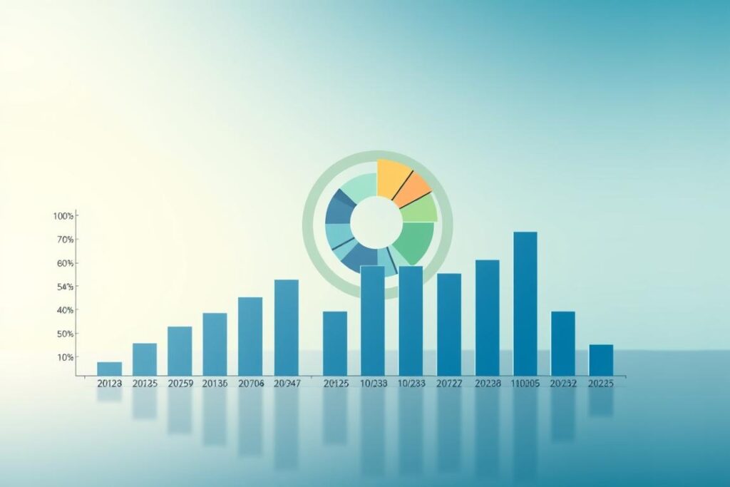
A clear set of percentile cutoffs lets readers see how household balances change from negative numbers up through multimillion-dollar thresholds.
Where balances turn positive
The lower end of the distribution contains many negative entries. In 2023 the 8th percentile sits at $1, so values below that are typically negative.
Example: a young adult with student loans and little savings can have steady income but a negative balance if debt exceeds assets.
Typical households across the middle
Mid-distribution thresholds show rapid growth in holdings. The 25th percentile is $27,016, the 50th is $192,084, and the 75th reaches $658,340.
These markers illustrate how “typical” balances rise as households accumulate homes, retirement accounts, and savings.
High and very high thresholds
The 90th percentile is $1,920,758, which frames high household wealth in practical terms. The 99th sits at $13,666,778 and marks a much rarer tier.
How to read the table logic
Each listed percentile in the table is a cutoff: the figure is the minimum needed to be at or above that percentile, not the average inside the group.
- These thresholds come from ranked household data rather than mean values.
- Small changes in asset prices or inflation can shift cutoffs noticeably over time.
For a related anchored comparison by age see this net worth percentile by age, which helps readers locate their household against age-based peers.
Trend snapshot: how net worth shifted from 2020 to 2023 after inflation adjustment
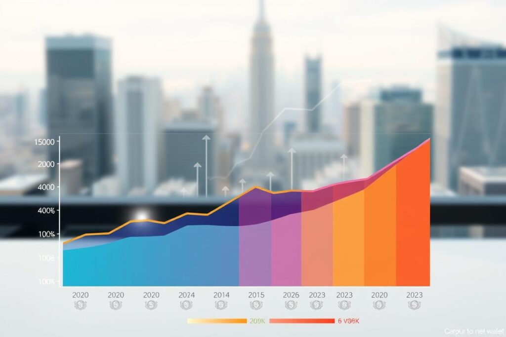
Putting dollar amounts on the same price basis shows who gained in real terms between the two years. The analysis uses the CPI-U-RS method endorsed by the Federal Reserve. That approach multiplies 2020 figures by 1.1592 to express them in 2023 dollars.
How the CPI-U-RS adjustment works
The multiplier corrects for price change so comparisons use the same purchasing power. This step is essential when comparing years with different inflation paths.
Also Read:
What moved at the middle and the top
The median rose from $121,411 in 2020 to $192,084 in 2023 in nominal terms. That large change reflects asset gains and life-cycle accumulation for a typical household.
- The 99th percentile: 2023 = $13,666,778 vs inflation-adjusted 2020 = $12,866,153.31 — a difference of $800,625 (+6.22%).
- Top thresholds show smaller percent changes even when dollar gains are large because base values are high.
- Market-driven assets like stocks and homes drive uneven change across the distribution, so composition matters.
Reading the data carefully: household vs. primary economic unit and sample sizes
Careful reading of sample design clarifies who the survey counts and why that matters for comparisons.

Primary economic units (PEUs) are the SCF’s reporting units. A PEU is the dominant individual or couple plus any financially dependent people who live with them. In practice, that definition usually tracks what readers call a household.
What a PEU includes
Multi-generation living is handled by grouping dependents with the primary adult or couple. This keeps the measure focused on shared finances rather than every person under one roof.
Sample sizes and precision
The 2020 survey had 5,783 interviews (6 redactions); 2023 had 4,602 (7 redactions). Those translate to estimated PEUs of about 128,642,430 in 2020 and 131,306,390 in 2023.
Fewer observations widen uncertainty, especially for tiny slices like the top 0.1% or narrow subgroups of individuals. The Federal Reserve System reduces this problem by oversampling likely high-wealth households, but some imprecision remains.
- Rule of thumb: focus on broad patterns across households.
- Treat small year-to-year shifts as possible noise.
- Use multiple benchmarks (median, percentiles, quintiles) together for a fuller view.
What’s driving differences between quintiles: assets, debt, and home equity
Real estate and outstanding loans are the clearest engines behind variation across the distribution. SCF-based research shows that real estate is the largest asset for roughly the 25th through 99th percentiles, while mortgages rank as the largest liability.
Why home equity dominates the middle of the distribution
Home equity often becomes the engine of middle-income households. A primary home is common, large in dollar size, and usually financed, so equity grows as principal is paid down.
How mortgages shape progress for households building wealth
Mortgages can mask real value: a high-priced home with a large mortgage may leave modest household net position. Over time, paying principal converts payments into equity and can move a household up the distribution without higher income.
The role of vehicles and cash in lower-wealth portfolios
Lower-wealth households hold relatively more cash and vehicles for day-to-day needs. That liquidity helps stability but rarely compounds like stocks or business holdings.
- Vehicles depreciate quickly and can limit long-term value growth.
- Mortgages remain the central liability that determines whether home value boosts real gains.
- Many middle households have much of their value locked in the home, not in liquid assets.
For context on including housing in household measures, see the discussion of including the home — including the home.
Portfolio composition by wealth level: why the top builds differently than the middle
Portfolio mix shifts sharply as households climb the distribution. That shift helps explain why some groups grow faster over time and why patterns look different across percentiles.

Stocks and private business equity gain weight
Higher‑percentile households hold larger shares in stocks and business equity. These assets offer higher expected returns but more volatility, so they matter more for long‑run growth.
Less leverage, lower forced‑sale risk
Leverage falls as wealth rises. Households at the top carry less debt relative to assets, which makes it easier to ride out market dips without selling at bad prices.
The “rich‑get‑richer” dynamic and its explanations
Small return gaps compound. For example, a 1% annual advantage over decades can double differences in final balances even if two households start similarly. That math helps show how asset mix matters.
- Access advantages: wealth can buy advice, private deals, and lower fees.
- Selection effects: high returns may come from past entrepreneurship that created the wealth.
- Practical takeaway: the top quintile is not just higher net worth; it often holds different assets and liabilities, which shapes future gains across households and percentiles.
Age and life-cycle patterns that reshape net worth quintiles over time
Financial positions often follow an expected arc across age groups, shaped by education loans, homebuying, and later payoff years.

Early adulthood: low assets and education debt
Young households usually hold modest assets such as cash and a vehicle. Many carry education loans that push their balance lower.
This combination explains why age is a big reason people sit low in the distribution early on. A low balance at 25 is often transient.
Midlife: housing accumulation and rising mortgage debt
Midlife often brings home purchase and larger mortgages. Mortgage debt rises, but so does home equity.
For many families, the home becomes the primary asset that raises household position even while liabilities remain high.
Retirement years: paying down debt while holding real estate and financial assets
Older households tend to pay down mortgages and shift into financial assets and housing equity. That change can boost financial security late in life.
Why credit card balances can persist
Even retirees sometimes carry a credit card balance. Irregular expenses, medical bills, or cash-flow choices can keep that debt present.
- Takeaway: compare within an age group when possible; the same dollar amount means different security at different life stages.
Race, household composition, and the distribution of wealth in the United States
SCF-based research shows the U.S. distribution has clear racial patterns, but the story is layered. Comparing households in the same percentile bins helps separate whether gaps stem from level differences or from portfolio choices.

What SCF findings suggest about Black and White household portfolios
The Survey of Consumer Finances analysis finds that within identical percentile bins, Black and White household portfolios look more alike than many expect.
Most observed variation is statistically explained by total wealth, age, and household composition rather than race alone.
How age, composition, and total balances drive portfolio gaps
Black households still hold less home equity, stocks, and business equity overall. Those asset gaps translate into lower average returns and slower accumulation over time.
Differences in age distribution and household size also affect where individuals land in the distribution and what assets they hold at a given life stage.
- Takeaway: use percentile and quintile benchmarks to contextualize subgroup differences.
- This is a portfolio-level finding about groups, not a claim about any single household or individual.
For age-specific comparisons see the by-age percentile guide at net worth by age percentile.
Limits of the numbers: what net worth statistics include and exclude
Reported household numbers summarize measured positions, not the full story of future income or sellable claims. Published tables generally show gross net worth values. They do not deduct likely taxes or model every household’s unique liquidation path.
Gross versus after-tax estimates
Most public figures are gross measures. After-tax proceeds from selling assets depend on tax status, timing, and specific rules. That makes realistic after-tax values hard to estimate consistently across people.
Why Social Security and many pensions are excluded
Social Security benefits and many defined‑benefit pensions are not counted as sellable assets. Unlike a brokerage account, future benefit streams lack a simple market price and usually cannot be traded.
- Two households with identical measured net worth may have very different retirement security if one has strong pension coverage.
- The Federal Reserve style surveys report what they can observe clearly; they do not invent market values for nontransferable benefits.
- Use percentiles and quintile placement for relative comparison rather than assuming a single figure equals take-home value.
Practical takeaway: these limits do not make the statistics useless. They simply define what the data measure and what readers should treat as an estimate rather than a final personal balance.
How to use these quintile and percentile benchmarks going forward
Readers can turn these percentile thresholds into practical checkpoints for planning and comparison.
Start simple: estimate assets and debt, compute your balance, then compare it to the 20th ($13,528), 40th ($110,314), 60th ($312,622), and 80th ($891,750) cutoffs and the median ($192,084). Use the 90th ($1,920,758) and the top 1% ($13,666,778) only when assessing very high holdings.
Pair these markers with income to judge near-term cash flow and saving capacity. Segment comparisons by age and use the CPI‑U‑RS factor (1.1592) for multi‑year checks when comparing 2020 to 2023 figures.
Treat survey year‑to‑year moves cautiously; focus on multi‑year trends for planning. For policy or public discussion, use quintiles for clarity, percentiles for precision, and the median to show the typical household position.
FAQ
Why do quintiles matter for understanding U.S. wealth inequality?
Quintiles simplify the full distribution into five groups so policymakers, researchers, and the public can see how assets and debt concentrate across households. They show differences in home equity, stocks, business equity, and liabilities like mortgages and credit card debt, highlighting where inequality is largest and which groups are building or losing financial security.
What does “wealth distribution” capture that income misses?
Wealth distribution reflects accumulated resources—real estate equity, cash, investments, and business ownership—minus liabilities such as student loans and mortgage debt. Unlike income, it reveals long-term buffers that affect retirement readiness, housing stability, and access to credit.
How do quintiles simplify the bigger picture of percentiles?
Quintiles group every twentieth percentile into broad bands (lowest 20%, next 20%, and so on), making trends easier to compare across time and demographic groups without losing key contrasts between low, middle, and high levels of household resources.
How is net worth defined in the Federal Reserve Survey of Consumer Finances (SCF)?
The SCF defines value as total assets minus total liabilities. Assets include cash, checking and savings, real estate equity, retirement accounts, stocks, and private business equity. Liabilities include mortgages, student loans, auto loans, and credit card balances.
What are the common asset categories captured by the SCF?
The survey records liquid assets like cash and savings, retirement accounts, public equities, home equity, and private business ownership. Real estate and investments often dominate at higher levels, while cash and vehicles play bigger roles lower in the distribution.
What liabilities does the SCF track?
It tracks mortgages, home equity lines, student loans, auto loans, credit card debt, and other secured or unsecured obligations that reduce household financial resources.
How are net worth quintile cutoffs built from percentiles?
Quintiles correspond to the 20th, 40th, 60th, and 80th percentiles. Researchers compute the net value at each percentile and use those thresholds to assign households into five equal-sized groups for comparison.
How do quintiles differ from specific percentile thresholds and brackets?
Quintiles are broad bands useful for summary comparisons; percentile thresholds (like the 90th or 99th) pinpoint concentration in the upper tail and help identify high-resource households such as the top 1% or 0.1%.
What was the median household figure in 2023 and what does “middle” mean?
The median represents the midpoint of the distribution: half of households fall below and half above. In 2023 the median provides a measure of the typical household’s position after adjusting for inflation and reflects the balance of assets and debts common to the middle group.
Why is average wealth often higher than the median in 2023?
Average values are pulled up by very high balances at the top of the distribution—households holding large stock portfolios or private business equity—so the mean exceeds the median when wealth is unequally distributed.
What does the top 1% threshold tell about concentration?
The top 1% threshold marks where household resources become extremely large relative to typical households. It signals sharp concentration of stocks, business holdings, and financial assets that drive large gaps between the top and the rest.
How reliable are estimates for the top 0.5% and 0.1%?
Estimates at the extreme top are subject to more uncertainty because very wealthy households are rare in surveys. Administrative data and specialized sampling help, but margins of error grow for the highest percentiles.
Where does net worth turn positive in the lower percentiles?
In lower percentiles many households have little or negative resources after debts. The point where assets exceed liabilities varies over time, often near the 25th to 35th percentile depending on housing and credit conditions.
What do the 25th, 50th, and 75th percentiles suggest about typical households?
The 25th percentile shows lower-asset households that may rely on cash and vehicles, the 50th (median) reflects middle households with significant home equity and some retirement accounts, and the 75th highlights stronger balances in real estate and financial investments.
How do the 90th and 99th percentiles frame “high value” in practice?
The 90th percentile marks households with substantially larger retirement and investment portfolios; the 99th isolates truly affluent households owning sizable public equities and private business stakes, where returns compound inequality.
How were 2020 and 2023 comparisons adjusted for inflation?
Analysts use the CPI-U-RS adjustment method to translate dollar amounts into constant dollars. That approach helps show real changes in household balances after removing inflation’s effect.
How much did the median move from 2020 to 2023?
The inflation-adjusted median shifted based on housing values, stock performance, and debt changes. Exact movement depends on data revisions, but comparisons show whether middle households gained or lost purchasing power over the period.
Why do percentage gains near the top often look smaller?
High-balance households have large bases, so similar absolute gains translate to smaller percentage increases. Volatility in asset markets also means year-to-year percent changes can be muted or uneven at the top.
What is a “primary economic unit” and how does it compare to a household?
A primary economic unit (PEU) is the SCF’s reporting unit, typically a household centered on a primary decision-maker. It closely matches household concepts but focuses on economic sharing and resource pooling for analysis.
How do SCF sample sizes in 2020 and 2023 affect precision?
Larger or more targeted samples improve precision, especially for high-percentile estimates. Differences in sample design between years can change confidence in year-to-year comparisons, particularly at the extremes.
Why does home equity dominate the middle of the distribution?
For many middle households, homeownership is the main form of accumulated savings. Mortgage payoff and rising home values often represent the largest share of their financial position compared with stocks or business equity.
How do mortgages shape wealth accumulation for middle households?
Mortgages let households acquire homes and build equity over time, but they also add sizable liabilities. Early in the life cycle, balances may depress measured resources until equity accumulates through payments and price appreciation.
What role do vehicles and cash play in lower-wealth portfolios?
Lower-wealth households often hold vehicles and cash accounts as primary assets. These provide short-term liquidity and transport but contribute less to long-term accumulation than housing or retirement accounts.
How does portfolio composition change across wealth levels?
At higher levels, stocks and private business equity form a larger share of assets, while cash and vehicles shrink in importance. Leverage (debt relative to assets) generally falls as households move up the distribution.
Why do higher percentiles rely more on stocks and private business equity?
Wealthier households have access to financial markets and ownership stakes that offer higher expected returns, tax advantages, and opportunities for further concentration of resources.
How does leverage change with wealth?
Lower-wealth households often carry higher debt-to-asset ratios—student loans, auto loans, and credit cards—while wealthier households carry smaller relative leverage, increasing net accumulation over time.
What is the “rich-get-richer” return dynamic?
It refers to compounding advantages where higher balances earn larger absolute returns, enabling faster accumulation. Competing explanations include differing access to investment opportunities and tax treatments.
How do age and life-cycle stages reshape distributional positions?
Young adults usually have low balances and education loans. Midlife sees rising home equity and mortgage debt. In retirement, many pay down obligations while holding real estate and financial assets that stabilize their position.
Why can credit card balances persist among older households?
Some older households carry revolving balances for liquidity or unexpected expenses. Even with asset accumulation, persistent credit usage and medical or caregiving costs can sustain outstanding balances.
What do SCF findings show about Black and White household portfolios within wealth bins?
The SCF indicates stark gaps in total resources and portfolio composition across racial groups. Differences reflect historic gaps in homeownership, access to business ownership, and disparities in inherited wealth and education.
How do age and household composition relate to portfolio gaps by race?
Variations in average age, family structure, and career trajectories help explain some portfolio differences, but persistent disparities remain after accounting for these factors due to unequal access to credit and investment opportunities.
What do net statistics exclude that limits interpretation?
Standard measures often exclude the present value of Social Security and many employer pensions because they aren’t easily sellable. Taxes and estate-related liabilities are also typically not reflected in headline figures.
What is the difference between gross and after-tax measures?
Gross measures list assets and liabilities before taxes. After-tax calculations would subtract expected taxes on asset sales or retirement income, but they are hard to estimate without detailed individual tax data.
How should readers use quintile and percentile benchmarks going forward?
Use these benchmarks to track where households stand relative to broad groups, evaluate policy impacts, and compare changes over time. Combine survey results with administrative data and attention to portfolio composition for deeper insights.
Asset AllocationEconomic disparitiesEconomic MobilityFinancial inequalityIncome DisparitiesNet Worth DistributionSocioeconomic StratificationWealth InequalityWealth ManagementWealth Quintiles
Hey there! I'm Jillian Hunt. I'm all about diving into the financial side of celebrities' lives and sharing those juicy details with you. I love turning complicated money stuff into fun and easy reads. Whether it's checking out how a newbie is making waves or seeing what the big names are doing with their cash, I'm here to give you the scoop in a way that's both interesting and easy to understand.